For both books, an easy-to-read children’s font was chosen that supported the storytelling and kept young eyes engaged.
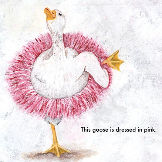
The illustrations, many created by Bonnie’s students and artist friends, required Photoshop work to ensure they met bleed and trim requirements.
We carefully arranged each spread, paying close attention to the way the story would unfold in printed form — making sure each image and page break landed exactly where it needed to be.
Since authors often review proofs in flat PDF form (and not everyone can “see” how it will flip like a printed book), we took extra care to manage the page count and layout so the final printed version looked and felt just right — even if that meant adjusting interior pages along the way.
Working with Bonnie was a joy from start to finish, and helping bring her classroom’s creativity to life was the cherry on top.